Gallery of Graphs: Coffee Sales Data

Photo taken while hiking Runyon Canyon Train in Hollywood, CA.
Find the full Power BI Dashboard file here, or the full project here.
I created a project where I took on the role of a consultant for the fictitious business Randolph’s Premium Coffee. My goal was to help automate their reporting process (see “Bots are pretty cool”) and visualize their sales data to uncover actionable insights.
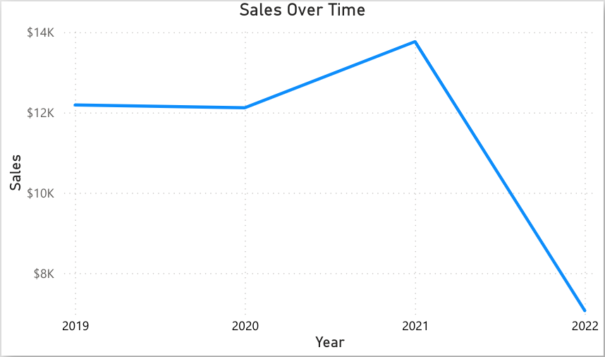

Based on the data, it can be inferred that the coffee shop likely closed for business in 2022, as sales saw a significant decline. Medium-sized coffee bags were the top-selling product, and the majority of customers were from the United States, outpacing sales in Ireland and the U.K.


